Monday, December 10, 2012

Vampirez'd

Out last week on DTRPG...Silent Knife.

This is the first WoD novel that I designed for PoD, PDF, Epub, and Mobi formats. Needless to say, quite a bit of trial and error but in the end it all came together nicely.

So, if you find yourself in need of something to read...or if you know someone who is getting an Ipad or Kindle for Xmas, why not go and pick up Silent Knife. C'mon...it has the word Knife in the title. That is enough for Chad Brown to be all over that thing.

Saturday, December 1, 2012

Yes, as a matter of fact I can do cutesy art....


Back in October, I was asked to do artwork for a children's app for Christmas. I know what you are thinking..."Mike you do children oriented artwork all the time...this should be easy". Well, you are kind of right. I have always love cartoons...I grew up watching Looney Tunes every morning before and after school. Heck, I still watch them whenever they are on.


But, after about 20 years of drawing guns and monsters (and getting payed to do it) I jumped at the opportunity to do something out of the ordinary for me. Granted, I've done some illo work in the "cartoony" style, but that had been for goofy one off gags for Mwahahaha! and assorted goofiness at the White Wolf offices (although, I never got to make the "How to use the Bathroom Correctly starring the Wizz'rd" and lord knows it would have been useful there). All of this artwork was influenced by my love of Christmas specials from the 70s and 80s (Garfield's Christmas Special was a tour de force when you are a kid). I also brought in some influences from some modern cartoons such as Adventure Time, Grim Adventures of Billy & Mandy, Dexter's Laboratory, & Foster's Home for Imaginary Friends (and yes, I still watch all of them on Cartoon Network and Boomerang).


All of the artwork you see here orginally started out as a pencil drawing which I then "inked" and colored in Illustrator. Up until that time, I had used Illustrator primarily as a tool to create logos and simple graphics and icons, but never full blow artwork. Luckily, Craig Grant posted a link to a Youtube video that would turn out to be my Rosetta Stone for Illustrator. Seriously, I will whip out Illustrator at the drop of a hat now...the hell with Photoshop.

What I think set this illustration gig apart from many others is I had a lot of fun doing it. I haven't had this much fun drawing something since I did Freak Legion back in "the Olden Tymes". I'm really hoping to get the chance to do some more art in this style. Got my fingers crossed.

Wednesday, November 21, 2012

Need some holiday reading?

If you are like me, you don't want to be anywhere near a store, mall, outlet, or market of any kind over the next couple of days. Why not spend it curled up with a nice book (or vitual one for whatever tablet/e-reader you might have). What's that? What book should you be reading?

May I suggest the God-Machine Chronicle? Well, I'm gonna anyway. 

Wednesday, October 31, 2012

Deadlands'd...

My first project for Pinnacle is out today...well in PDF form anyway. I did the layout and some cartography for this particular book (I did a map and it's more of an artifact that an actual map).

The book has some fantastic art on the inside as well as the cover. And the format gave me a chance to do some cool stuff that I don't get to normally do (although if you have the SAS version of Falling Scales 2 I did manage to slip some of that in there as well). Let's just say after this book, I really love the gradient feather effect in Indesign.

So, if you have the time and a couple of bucks to spare, why not go and treat  yourself. Hopefully, I'll be doing a lot more of these in the future.


Tuesday, October 30, 2012

Halloweeeeen'd

I have had no time over the last month to work on a special piece for Halloween...which kinda sucks as I had something cool in mind. To date, I have never been able to get a personal project with a seasonal theme done in time. I am going to try and do a macabre Thanksgiving piece though.

So for now, I'm posting some images that I haven't posted before. To the left is the Fleshbound Vampire from the Bonegarden d20 adventure. I ended up having to illustrate most of the monsters in the appendix for that book. Why? Probably something to do with making the book a higher page count, so the monsters had to get a full splat rather than a stat block.

To the right is the Blood Golem thing I did for Hollowfaust. It wasn't fill in work....but it did happen at the same time I had to do some fill in for another d20 book...so instead of one book with really awesome art I did two with acceptable art. But still...I think the piece is kinda neat.

Well, that is all the time I have today. I have a secret art project I've got to get back to.
Check back by and see if I manage to get the macabre turkey day piece done.

Mike C.


Thursday, October 25, 2012

Shameless Self Promotion...

Soon, my first published art in about 5-6 years will hit the streets. If you have followed the blog, you will have seen the evolution of the Bobby Hill vs Evil piece (that's what I called it anyway) from a sketch to a fully inked and colored piece. If you click on the preview link on Green Ronin's site, you can actually see the piece in the preview.

Haven't been this excited for a book I did art in to come out since Book of Madness in 94.


Monday, October 1, 2012

Woobedow! pt 1

Bobby Hill vs Evil the Redo is done and approved!
The main difference this time is just a lttle extra detailing in the color and some of the rendering. For so long, I have over rendered pieces for so long, I played it safe (or so I thought) and kept the rendering to a minimum. 

Oddly enough, this is pretty much the style I did for Midnight Circus back in the day. I've always wanted to revisit the style, and now I have gotten that opportunity. Granted the Midnight Circus stuff wasn't colored...but I think the similarity is there.

Also happening this week is the release of the first of the Savage Mojo products I did the interior layout and design for. Yay! The Millennium Knights Primer is a free download at here. If you like Mission Impossible, Blade, the Matrix and all the other great action films of that kind from the 90s, then this is for you.

Might be shifting into miniature painting mode over the next day or so...been working on a commission for quite a while now and I need to get it done. However, I have a couple of personal illustration products I'm working on as well as three or four more titles coming out the next month or so from various publishers which I'll be posting cover shots and links to (try and talk them into doing an interior sampler done in flash).

But first, I need to take a nap.

Fun Fact: I probably drink so much soda my blood is carbonated.

Another Fun Fact: Kroger Diet Red Drop is more delicious than Diet Mtn Dew Code Red. Yes, that borders on blasphemy...but at 89 cents a bottle why wouldn't you commit blasphemy? No escaping, that's for me, blasphemy, blasphemy.

Friday, September 28, 2012

More artsy, less fartsy!

Yeah. It's another version of Bobby Hill vs Evil. Long story short, they wanted some tweaks to the piece...which required me to break out the lightbox and fix things up. This time, I experimented adding the "tick" marks in with photoshop so they'd have a nice uniform look to them. I also added some texture lines to the lampshade trim.

This weekend, I plan to add color. Same color scheme as the previous versions...although I might add some additional shading .

To the right is my map of Blackgate Prison. No it isn't a map for an RPG campaign or a miniature terrain project. This is a topdown map of my Killing Floor map I started designing back in 2010. I put the finishing touches on the map here and there over the last couple of months.

It is sort of like the Horzine building map where it sort of connects to the underground lab level. This map you actually have three different sections that are basically their own map (although you'll see snippets of the other maps in the "window box" areas around the edge of the map. Odds are, I'll end up just putting it together in UDK as the KF SDK is really clunky (using Unreal 2004 is like me laying out a book using paste up boards and an exacto knife...doable but torturous). But I keep drifting back to the idea of using the KF SDK simply because it would give me an actual functioning level.

I have another map I started back in October of 2010...but I can't show it until I make some serious alterations to it for "reasons".

Thursday, September 13, 2012

Blood Sorcery!

Go check out Blood Sorcery for Vampire the Requiem. This is the latest title I graphically designed for Onyx Path Publishing.

Fun Fact: Kruella is still one of my favorite fonts.

Other Fun Fact: I have a library of over 100 blood spatters that I've made over the years using india ink. About 75% of them have shown up in various WW titles over the last 12 years.

Tuesday, September 11, 2012

Inked!

After three attempts, I finally got the piece inked to a standard I can live with. I'm still debating blacking out the back wall completely (which is why I love photoshop).

I left a few tick lines on the bed spread, although I see some on the back wall which will need to be cleaned up (or painted over if I just black out the back wall).

But once clean up is finished, I'll take the piece into Illustrator and run live trace on it to give me smoother lines. Although, looking at the piece at size, I don't think it will be a problem just to color over the tiff as is.

Now, I start researching my color palette for this piece. All desaturated earthtones of course.

Monday, September 10, 2012

Revenge of the Pencilator

I gave the piece another going over after a catastrophic inking attempt on Saturday. The redone piece is on a piece of art paper specially made to stop bleed from ink and markers (yeah...but apparently not as good as they thought). Thus far, I haven't had any horrific bleed but all I've inked thus far today are the geometric areas of shadow on teh wall.

I did make a few changes to the piece in the penciling stage this time. I removed the footboard thing, shifted the door up a bit and spent a little more time on the teddy bear. He has big evil eyes now ( and yes, they will be glowing along with the relic on the table). Hopefully, I can get this thing inked now and get to the coloring.

Sunday, September 9, 2012

Lack of daily doodles over the last few days...

Had to give Bobby Hill vs Evil some work. This time I repenciled the piece at 140% size to clean up some of the detail work. Unfortunately, I didn't notice how off the door was until now. So...I plan to fix that in photoshop. Just needs to move over towards the left edge a bit and enlarged up towards the upper edge.

How? Once I scan the piece in, I'll reduce to down to actual size for coloring and I'll take the door from the original scan and paste it in. Once it is in, all I have to do is make it blend in with the shadows around it and boom...done. 

What has this taught me? I still have some way to go before I'm ready to dive back into illusttation work full time. 

Tune in this week and you can witness me meltdown as I try to ink. I've already tried brush and ink and it has failed miserably, so it's time to go to the old standby Pigma pens.

Wednesday, September 5, 2012

Finished Pencils

As I look at this piece, I can already say that the foot of the bed thing is going away. I'm going to do a  fog/smoke effect on the bottom of the door to give the impression of something trying to get out.

I'm going to put together a second version of the piece this weekend as this piece still isn't blowing my skirt up. Yes, it depicts what it was supposed to...but it isn't something that is uniquely in my style of presentation and composition.

Tuesday, September 4, 2012

Daily Doodle(s)

Today's doodle comes from a sketch I did back in 2001 after watching the House on Haunted Hill. Most of my illustration work is inspired in one way or another by film and television. I have always prefered pieces that had a cinematic quality to them rather than something that looks static or posed. As a consequence, I've always preferred to given the source text for the pieces I do as opposed to having a specific scene. A specific scene leaves no room for interpretation and you are limited in your options for the piece. 

Is a collection of pencil sketch, concept pieces I did back in January. I drew a happy apple, an ecstatic popsicle, and an exhuberant creamsicle. Also pictured was a cutesy little marshmallow guy in a beanie that has a problem with law enforcement. And lastly, a generic style henchman illustration for a cartoony card game that has evil scientists and doomsday devices.

Monday, September 3, 2012

Penciler's Progress...

Progressing right along. Still working some stuff out like the shadow on the left side of the picture frame and the width of the kids shoulders. I'll probably narrow them up a little more. But the idea is he's pulled his legs up and he's sort of in a ball as he's terrified of the thing in the closet. 

I'd like to point out I suck at drawing kids. It's one of those things where I have to just keep modifying things until it looks right ( probably raise the collar on the pjs as well). But getting the kid just right is the point of today.

I added a "funky" relic on his nightstand to add a little more character to the piece. I'm still trying to figure out what to put on the right side other than the closet door. Still roughing in the folds in the quilt as well.

Penciling pt 3 or a Doodle A Day pt 3

Today's doodle was a practice in one of my weaker artistic areas....drawing architecture. I've always had trouble with either adding too much detail or not enough. This piece here, is closer to what I am going for...although looking at it now, I can see a few places I think I need to make some tweaks.

The piece itself is a Romanian castle. I've actually drawn this castle several times for Dark Ages Vampire...once in Under the Black Cross, Devil's Due, and a few others I can't remember off the top of my head. The actual location is Bran Castle, although I took several liberties with the landscape (mainly the mountains.

Fun Fact: I watched Forbidden Planet this morning and I had forgotten what utter horn-dogs the crew of Leslie Nielsen's spaceship were. Seriously...they were eyebanging Alterra from the second she walked into the room.

Other Fun Fact: The effects for Forbidden Planet are far superior to the effects in Logan's Run.

Now back to penciling my paying gig piece. I have to be 2/5 done with it by end of day today to stay on schedule.

Saturday, September 1, 2012

Warm up Penciling pt 2

Watched the Black Cat this morning...so I figure I'd draw up Boris Karloff as Hjalmar Poelzig. Again, just a warm up piece to get me back into doing not so cartoony stuff (I've been doodling kid friendly stuff for the last 8 months). Again, using the Mignola principle...you either put the heavy blacks in the foreground or the background. The background will just end up being a flat color with a lightened portion to simulate the light being cast from the right side. I went a little more towards realism for this one...well...realism for me anyway. This one is definitely more like the style I used for Midnight Circus and the Syndicate headshots. 

On a side note, I really miss doing NPC headshots. From about 2001-2004 it was my big artistic thing that I did on a lot of White Wolf books. And to be honest, I still feel like some of my best work were the headshots I did.

Also to the left you will see the Dudes of Legend layout for page 1 of the comic. I did this about a year ago. Right now, there is just me, Brian, and Craig (wearing a Hawaiian shirt). There is a fourth guy, but I have no idea who that was supposed to be...maybe Vinnie...although the bloody butcher apron screams Chad Brown. He does like to murder Central American prostitutes.

I was gonna go Batman the Animated series styled with it, but it's looking more and more like I'm gonna go full balls Mignolient with it. Can't really say for sure though...just depends on the mood I'm in when I decide to pencil it.

Fun Fact: The cover to Queensryche's Operation Mindcrime is what really started my artistic style down the more graphic style road. 

Other Fun Fact: My portable drafting table kinda sucks. I miss having a full on drafting table for doing art. I also miss having a desk to do nothing but miniature painting on, but that is a rant for my other blog.

I am now going to go take a nap or something.

Warm Up Penciling....pt1

Started doing warm up pieces this weekend to shake the cobwebs out before I start penciling  Bobby Hill vs Evil. I never go in to working on a paying gig without doing some of these.

First one of the day is an Abe Sapien piece. Simple Mignola styled piece...character in foreground and a creepy graphic element  in the background. I opted for a Piranha skull rather...it just looked more evil.

Once I get the Bobby Hill vs Evil piece penciled, I'll practive my inking on this guy as well. Now, gonna go do a couple more and then settle in to do the big piece.

Wednesday, August 29, 2012

I miss Aberrant....

Many eons ago in 2000, I did a bunch of little vignette styled pieces for the super powers in the Aberrant Player's Guide. This was my first real Aberrant assignment....I did some headshots from Worldwide Phase 2, but those were "fill in" type pieces.

The whole idea behind the pieces was that they weren't scenes as much as just quick glimpses of what that particular power did. The one to the left was super strength or something like that. I kept it simple...super hero lifting giant rock. I think I used my own character, "Liquidizer" for this one (his "heat vision" type power basically reduces people to a puddle of glue and bones).

Using your "own" heroes was also fun. I do not like "iconic" characters in RPGs. Why? Because over time you get several different versions of the character and half the time they don't look right. For this assignment, I used guys I'd had in my sketchbook for eons (make sure they are characters you don't really care about as they'll become the property of whomever you do the work for).

My only real regret on this assignment was not doing any grayscale shading in it. Instead, a crapload of black and tick lines out the wazoo. Still, I hope to revisit these pieces again one day...clean up the line work and slap some color on there. 

Fun Fact: Chinese Donuts are better hot than cold.
Another Fun Fact: I probably watch the Big Bang Theory waaaaay too often for my own good.

Stay tuned as I'll be posting up some revisions to my sketch for the unnamed rpg project I'm working on. Today, I work out the particulars of the perspective...then hopefully tonight start the pencilling. 

Tuesday, August 28, 2012

The Sketchening Extended Director's Cut....

I was flipping through one of my old sketchbooks today and I found this.  This was for some sort of free pdf Warhammer fan magazine from back around 2003-2005. As with any sort of "fan" publication, it imploded before the first issue went into layout (I know as I was also doing the layout).

I think after things imploded I added the pentagram. Kinda cheesy...just like every t-shirt design ever created for Motley Crue (feel free to insert the name of any hair metal band if you happen to be a big fan of the Crue...and I'm not laughing at you, I'm laughing with you).

Thinking about reworking the piece now into a more Warhammery/Mordheimish page element of some sort. Maybe one day, I'll get to layout an RPG book that is based on Fahfrd & the Grey Mouser (FYI...I can draw the shit out of Faf and Mouse).

Fun Fact: I have a ton of sketchbooks with only 10 pages of sketches in each.
Another Fun Fact: Most of those sketches are of human faces.

Stay tuned as I try to find my sketch of "Rob Liefeld Draws Dickbutt"....although, I'm thinking about doing up my version of Dickbutt now.

The Sketchening pt 2

Had a sketch redo. This time, I pretty much based it word for word on the description. Kinda meh...but what can you do. So, for this piece, a terrfied Bobby Hill looking kid is huddled up under his blankets and is staring at the "closet door of doom". The only light source for the piece will be a window which is out of the viewers field of vision. I'll probably do a light blue hue to the whole thing. I'm still thinking about maybe having some sort of mist coming out from under the door...just to push the idea there is somethign behind it and not just some wuss of a kid staring at an empty closet.

As far as my whacky perspective goes, I'll be setting up a model shot in Maya or Sketch up and then fiddling with the camera's settings to get the appropriate perspective reference. I don't consider it cheating if I'm the guy who is building the models and the scene.

Fun Fact: Monty does not like to be woken up or moved at anytime. Ever.
Another Fun Fact: My sleep schedule is so screwed right now, it is pathetic.

Monday, August 27, 2012

Sketchbook: the Doodling pt 1

So exciting news here in Lilburn...I'm once again doing illustration work. It exciting and terrifying at the same time. I haven't done what I would call "professional" illustration in almost 8 years now. Most of my work from 2004 up until 2011 consisted mostly of fill in work for when artists bailed on a White Wolf project or for personal projects which mainly revolved around me making jokes about stuff (and I promise, Dudes of Legend ™ or Dudes of Yore™ will eventually see the light of day.)

So what I'm doing for this particular project is a half page color illo. Yes, color. Luckily the client uses a great deal of color b&w art.

For this piece, a child is afraid of the "monster in the closet". The initial image that popped into my head is over to the left (well, a sketch of what popped into my head anyway). The main idea I'm going for is that the closet is a dark a forboding place the child is terrified of and then I will take the shadows from the closet and "morph" it into the monster at the top. I'm still not sure about the monster....I have a werewolf up there now, but I also had a cthulhuesque type critter up there....and an angry goblin.

I'm also still hashing out the color scheme as well. I had though of a strong yellow light being cast by the door but now, I'm thinking of almost a blue to simulate moonlight illuminating the child's room and a small part of the closet interior. I'll figure out what color for the critter part once I settle on a critter. 

Another thing that I am toying with right now is the use of a texture over the color areas to give it a sort of watercolor effect. Don't get me wrong, the idea to actually paint the piece has crossed my mind but I'm trying baby steps here. So, I'll probably either drop a paper texture over it or maybe just a light "clouds" texture. Mainly just something to spice things up.

The piece to the right here is the beginnings of v2 of the sketch. Yes, the fat kid in the foreground does look like Bobby Hill from the back. The idea for this piece is the child is peeking out from his hiding place on the other side of the bed. I'm toying with doing a window pane shadow across the wall to add something to it. Again, this is just step 1...I'll take this piece, trace it onto another piece of copy paper and add more to the sketch (or make changes) until I get something I like.

I should probably point out something about my sketches. I use them as a reference for placement of objects and figures...and maybe some of the lighting. I'll sometimes change poses and various details in the final if I think it'll look better. That's why they are sketches and not pencils.

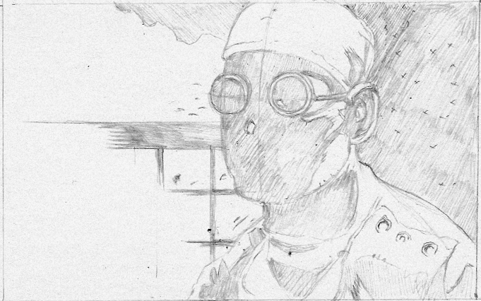
Last thing for tonight, these are some doodles I did to warm up.They are not works of art by any means...just me messing around with my fine point sharpie. I think the dude on the left was the beginning of a goblin type guy and the wolf thing on the left was me trying to come up with ideas for the critter in v1 of the sketch.

So that is all for tonight. I need to try and get a little sleep so I can do my usual daytime work stuff. Hopefully, I can post some of that stuff in the near future (I have to ask).

Fun Fact: The Bacon-Cheeseburger Taquito at Quik Trip is a true delicacy.

Another Fun Fact: The 49 cent soda  promotion at Quik Trip is over, and I'm not happy about it.

Friday, August 24, 2012

Cleaning up the blog a little....

No, you didn't have a brain aneurysm that screwed up your memory or anything like that. I'm cleaning up some of my blog posts...you know, the ones where I ramble on about crap forever because I posted it at 4am.

Why do I do that?

I honestly have no idea why. Maybe it's sleep deprivation or the lack of energy drinks in my house. Whatever the reason is (secret government radio waves), some of my previous posts have been wiped from the face of the internet.

So to compensate everyone for the loss of those pearls of wisdom...those steaming piles of personal insight, I give you the "Undersea Kingdom" from a Gamma World book that I didn't even bother to remember the name of. Here's a fun game, try and find the character from the Little Mermaid in the piece.

Fun fact: I took a date to see the Little Mermaid. The movie was her choice. As a matter of fact, the only choice I got to make that evening was butter on the popcorn...after having a five minute argument about it.

Moral of the Story: Never let your date choose the movie or the presence of buttery toppings on your popcorn.

Tune in this weekend as I will have some actual posts about art and design and not just me making quips about how whipped I was my senior year of high school!

Wednesday, August 22, 2012

Falling Scales 2!

Sweet!

My first official Onyx Path title is out. I did the layout and design as well as working with the artist on the cover.

What is it? Well I'm glad I imagined you asking that. Falling Scales is an adventure for the World of Darkness. It's sort of like those modules you'd get for D&D in the old days (or a few years ago if all the D&D you know is d20). They are fantastic for those gaming sessions where you just didn't have time to put together your own adventure for the group.

This one is actually pt two of the adventure (I also did the layout and design on pt one, but right now I'm pimping pt two). But you can check them both out at Drivethrurpg.com.

Check it out!

Fun fact: the SCALES part of the logo was made using the font Zamora. Another fun fact: the only reason I ever even checked out that font was because Zamora was the city in which Conan and Subatai stole the Eye of the Serpent in the original Conan the Barbarian. A third fun fact: Sandahl Bergman was super hot in Conan the Barbarian.

So to sum up: Go check out Falling Scales 1 & 2 and Sandahl Bergman was really hot in 1982.